One of my recent obsessions is handmade books as a vehicle for my palladium and cyanotype prints. To complete the “handmade-ness” of these objects, I’ve learned the venerable craft of handset letterpress.
I started this journey a couple of years ago by taking a letterpress workshop taught by the amazing Eric Johnson at Iota Press. I did a few projects there using their presses and type before deciding I wanted the ability to do this in my studio. The problem was that I needed a press that could accommodate 10×20″ spreads. Not only are these machines very hard to find, at that size they are very expensive and too large for my studio.
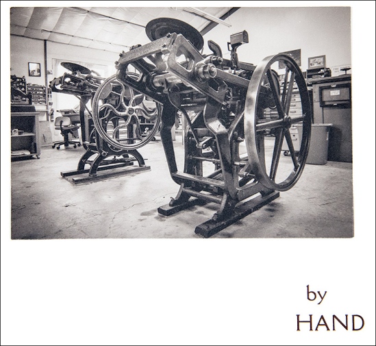
After a lot of research and discussion with Eric I decided to buy a small etching press and modify it to handle letterpress. I purchased a Blick 906 press for about $900. A real letterpress machine would have cost many times that much.
The challenge with any letterpress machine is that you are dealing with tolerances of a few thousandth of an inch so you have to have a lot of control – etching presses are not typically used that way. Here is my press:

The most important addition I made to the press was to have two “bearer bars” machined at exactly .918″, so-called “type high”. The lead type used in letterpress is this height so it was critical that I had bars of steel on either side of the press bed that would support the cylinder at exactly the right height so that the right pressure could be applied evenly to the paper. I had these machined in Arizona for about $100. You can see them gleaming just outside the top and bottom edge of the galley in this picture:
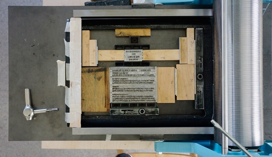
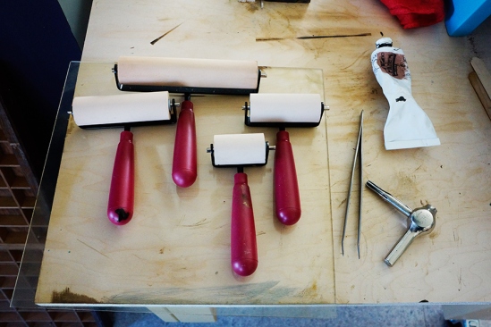
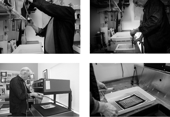
This is a text block I printed this morning, a colophon page in my latest book. All the blocks of wood and metal surrounding it are called “furniture”. Everything gets locked in tight, first while the fonts are hand-inked with brayers and then later when the paper and “packing” are placed carefully on top of the type and run through the press under the pressure of the cylinder. Packing is sheets of paper placed on top of the paper you’re printing on to create the desired impression.
Hand inking with soft brayers is also a challenge, I’m still developing the right touch to do that evenly. There are definitely some tricks to doing this right as well!
One of the cool things about letterpress is that you get to use actual lead type. At first it’s pretty tedious to set the type letter by letter, but once you’ve done it enough you memorize where each letter is in the cases and it goes pretty quickly (not like using Microsoft Word but more fun!). Here is a case of my go-to text font, Bembo 12, designed in 1929.
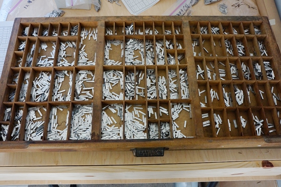
We are fortunate to live in the same town as one of the few remaining font foundries in the world, Pat Reagh Printers in Sebastopol. Pat is a true master of letterpress and a great guy as well. His shop is of historical importance in this field. It’s surprisingly inexpensive to buy fonts, a full set of 12 pt type typically costing less than $100. Of course, there are many fonts in many sizes and once you catch the bug, you may find that there’s always a new font you think you need.
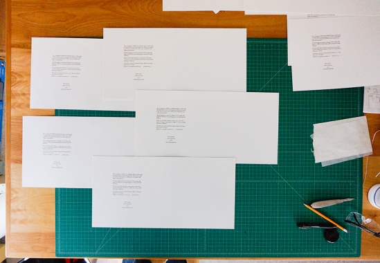
Here are some pages that I printed this morning using the text shown in the photos above:
I’m still learning the craft of letterpress but am confident that I can now make my modest modified etching press do what I need it to do. It’s been a lot of work but it’s starting to pay off!
And by the way, Eric Johnson recently created North Bay Letterpress Arts, a non-profit organization in Sebastopol to do with all things letterpress. Check them out!
 Jason Avery Kelch
 Jennifer Bec Hirshfield
 Bill Wheeler
 image transfer on stone paper
 image transfer on stone paper
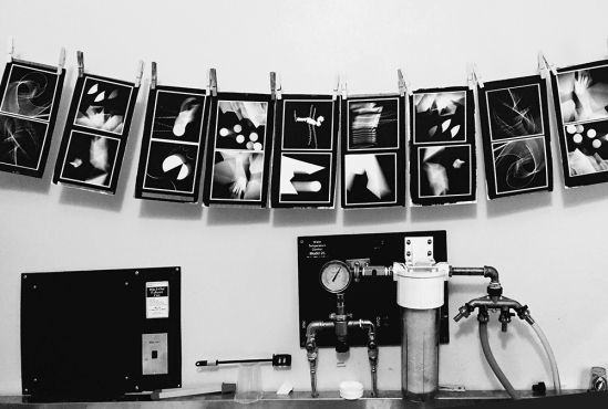


